Friday 16 December 2016

Practice - Week 12

I diverted away from the red, because it was incompatible with the white warp. I focused on the curves created by the peacock feather in my photograph instead, abstracting the form, resulting in successful minimalistic monotone drawings. The inverted effect created with the white ink on black paper is an interesting theme I would like to explore within my weaving.

My peacock photograph & my drawing

I translated my drawings into weave using black monofilament with the white warp, creating 3D spirals with huge potential. I would like to emulate this vice versa to recreate the same inverted effect that my drawings had.

My spiral monofilament weaving

My weaving related to work by Vicky Olivera, who also obtained inspiration from spiral forms. This inspired me to experiment with other media like wire and pins. However, the wire ruined the quality of my weave, as it was too thin and unrefined.

Vicky Olivera weave

During group discussion it was mentioned that my pieces resembled Elizabethan fashion collars, due to their flamboyant essence. This was a helpful suggestion for my context, and related well to my dark colour palette.

My drawing & woven experiment (pins)

I wove with monofilament and silver lurex to emulate the shimmery effect of the condensation on the bus windows. I experimented by incorporating pins in an attempt to push the boundaries of my weaving and create an uncomfortable reaction to my potential fashion accessory. This relates to the impracticality of the Elizabethan collars, however, the placement of the pins were a safety hazard, so I discontinued the idea.

Friday 9 December 2016

Practice - Week 11

I began my second self initiated project by photographing the dismal view I had during my bus journey home. I wanted to respond to the weather, as I had done with my first project about florals. The reflections of light contrasted exquisitely against the dark atmosphere, and the condensation on the window created interesting textures. I deliberately pixelated the lights in certain photographs to abstract my results further.

My drawing (acrylic, foiling) & my window photograph

I responded by drawing in a completely different and experimental way, to push my boundaries and create a clear contrast between my two projects. I used black paper and foiling to recreate the textures of my photographs. I was feeling frustrated during this time of year, due to the dark weather and stress of travelling in the unsavoury conditions. This frustration was reflected in my expressive style of drawing: the marks continued past the edges of the paper and the bright red was striking against the black background.

My failed sample with foiling

I was further frustrated with the unsuccessful results I obtained whilst I was weaving. The white warp lightened my red yarns, and the foiling technique that worked well with my drawings, was ineffective and further worsened the quality of my weave. The yarn between the warps was the only salvaging aspect.

My photograph & drawing (acrylic & foiling)

I began drawing again, this time focusing my attention to composition, which improved my drawing and helped to inform my approach to my samples. I tested foiling on bubble wrap and coated my weave with it, which created an unusual result.

My weave (bubblewrap & foiling)

Friday 2 December 2016

Practice - Week 10

My abstract charcoal skull drawing

For my second self initiated project, I decided to expand on the warp structure I had created for my first project, by doubling the amount of sections. I was indecisive about what colour the warp should be, so I concluded by creating a white mercerised cotton warp, then dying half black. This decision was inspired by my initial abstract charcoal drawing of a goat skull in response to Georgia O'Keeffe.

'Flower of Life' - Georgia O'Keeffe


Friday 25 November 2016

Practice - Week 9

I began a work placement for a bridal studio 'Sandra's Studio' in London. I found the inspiration boards interesting, and compared them to the final garments. I helped to stitch inserts of a bodice, which required thick, strong thread with small, hidden stitches.

I practiced stitching lace onto fabric and was introduced to new machinery. I learned the importance of ironing seams in certain directions, as it affects how the garment hangs and avoids puckering the fabric. I was also introduced to lace and silk suppliers and participated in a client's fitting, where final adjustments were made to the bride's dress.

Pattern cutting

I was taught how to create my own pattern for a child's dress, which requires careful calculations and proportions. I ensured I cut out the fabric on-grain, to keep the pattern consistent. I attached the underlay to the outer layer using an industrial Brother machine, which allowed me to accurately sew. I found the overlocker difficult to use, as it required precision and excess fabric to work properly. Mistakes would ruin the garment, considering the machine cuts the fabric whilst it stitches.

My dress modelled on baby

I am pleased with the result I obtained, but found the process tedious and difficult. The floral pattern links to the Hand & Lock 'celebrations' brief, as flowers are used to celebrate special events such as weddings and birthdays. It also relates to the idea of "play" mentioned within the brief: my response being 'child's play'. My dress demonstrates technical construction skills, but is not an appropriate entry for the competition, because it lacks an innovative use of these skills.

Friday 18 November 2016

Practice - Week 8

During my group tutorial somebody noticed my work resembled bridal garters. Due to the nature of my woven samples, Stephy Ann lingerie was suggested as a contextual reference.

Stephy Ann Bridal Garter - Context

I identified my subtle colour blending as a strength in my weaving. However, my peach rose inspired weaves are less successful than my previous weaves, because the wool weft shrunk when I washed them.

Modelling weave as garter

I photographed my weaves in the garter context, which is an improvement to my previous placements and showcased my weaves to their full potential.

Board submission for Bradford Textiles Competition

I produced a woven sample to enter the Bradford Textiles Competition, which focuses on embellishment within the weaving, with use of textured yarns, to comply with the  woven requirements of the brief.

Friday 11 November 2016

Practice - Week 7

I was satisfied with my white floral samples, and decided to explore something more colourful. I focused on a different flower, dissecting the two tones of pink of the petal. This translated well within my weaving and created a distinct two-tone effect. The wool I originally used was unsuccessful, because it failed to capture the quality and elegance like the mercerised cotton did.

My weaving

I created crochet chains in response to the remaining colours of the flower. The centre of the flower was translated with yellow French knots to capture the rich texture. I altered the placement of my weaving on the body, as the structure makes it more suitable as a decorative cuff.

Embroidered weave modelled as cuff

I reflected on my aims and divided my time for the remainder of this unit in conjunction with my proposal. I aim to finish my first self-initiated project, enter two outward facing projects, participate in a bridal studio work placement and produce a darker second self-initiated project in relation to the commencing winter month, inspired by Alexander McQueen.

Time management plan

I discussed my proposed schedule with my tutor about my outward facing projects. I was advised to participate in work experience for one week, so that I learn essential skills within a reasonable time-frame. I was also advised to extend my time frame for my Hand & Lock project, to ensure I spend enough time developing a final piece.

Friday 4 November 2016

Practice - Week 6

With each weave, I noticed improvement as my techniques became more refined. I also started to obtain a vision of my context: to produce neck pieces. The space between the two woven structures could offer an unusual element to my fashion pieces.

Embellished weave

I created floral forms that embellished the surface of my weave, which I placed in a repetitive format to create a sense of order. This was a contrast to the opposite side which was an entanglement of embellished yarns to emulate flower buds. However, the cornely moss technique created a more refined result. I also experimented by incorporating fabrics and chains of crochet. I attached sheer, lightweight fabric to the edge to create a ruffle, puckered with the embellisher. This developed my neckpiece to encapsulate the body.

The weave was modelled as a neckpiece, but the result I achieved was not what I desired. The nature of the weave was not appropriate for that surface of the body: the structure was incompatible, because I did not consider the width of the shoulders and shape of the neck.


Unsuccessful modelling weave as neck piece

Friday 28 October 2016

Practice - Week 5

During my presentation feedback, artists were suggested for further inspiration. Laura McPherson's use of lines of colour relate well to my colour proportion work. Her structures are interesting and offer compositional solutions.

Knit by Laura McPherson

This Is Colossal's website offered a range of contexts I could explore. In particular, Rebecca Louise Law's floral installation could be a potential context for my passementerie pieces. I could create a mass collection of long, narrow structures that hang together to create a large installation.

Rebecca Louise Law

I believe I require the structured format and time-span involved with weaving to use my time efficiently. Although the warp is restrictive, the weave rotation motivates me to produce work to a schedule, which enhances my productivity. I created a warp consisting of alternating white and cream mercerised cotton to allow complete freedom of colour with my weft. It consists of two narrow sections with a central gap to create interest.

Unsuccessful weave

My first plain weaving based on my colour proportion was unsuccessful because it was too bold and had no substance, so I created a series of drawings which inspired me to change my entire attitude towards my weaving technique.

Drawings & design ideas
I used the structure of my warp to represent the composition of my floral reference. I inlayed yarns to create the texture of the floral elements, which gave my weaving life and movement. I then decided to explore this further with embroidery machines, where I refined my idea.

Plain weave & inlay yarns

Friday 21 October 2016

Practice - Week 4

I focused on improving my crochet chains by utilising my colour proportion swatches extracted from my floral photographs. This resulted in an abstract interpretation of my colour, whilst retaining the floral essence created by my crochet patterns.

Colour research & crochet chain

I developed my crochet chains further by attaching fabric to the edge, creating a developed form. This sheer, lightweight fabric successfully captured the essence of the delicate petals, whilst the crocheted mercerised cotton emulated the structure of the flower's centre.

Colour proportion, crochet chains with fabric

I found creating my presentation helpful for reflecting on my direction. I presented these structures, where I gained useful feedback. I was advised to discard my wire structure samples, as they were too literal, and to instead focus on passementerie structures involving crochet, weave and fabric. This was reassuring feedback, and I agreed that these structures were more sophisticated and offered more potential. I think combining these elements will be interesting and provide a structure for my own working process.

Friday 14 October 2016

Practice - Week 3

Elie Saab was suggested as context for my work, which relates to my floral concept. I could potentially create a collection of forms to embellish a garment with. This also inspired me to explore form further as three-dimensional. I incorporated wire to create structure, resulting in ruffles and repeated forms.

Elie Saab

I improved my crochet form by using thicker yarn, however, I preferred the crochet chain before I constructed it into a 3D form. This inspired me to perhaps focus on trimmings of garments or jewellery. I discovered Lizzie Fortunato, who incorporates elements similar to crocheted structures in her necklaces.

Lizzie Fortunato

Friday 7 October 2016

Practice - Week 2

My photograph with cornely chain sample

I interpreted my floral forms with a variety of embroidery techniques to become accustomed to the machines. The cornely machine is fast-paced and creates a robust quality, resulting in an interesting abstract interpretation of the forms.

My photograph with embellisher sample

The embellishing machine puckered the fabric to create movement in the surface, resembling petals. The machine is easy to control, so the result is sensitive, and a technique I aim to take further. 

My drawing with hand-stitch sample

I used simple stitches to recreate other floral forms, which provided more accuracy, but was less time-efficient. I crocheted a 3D form, which was unsuccessful in colour and lacking in structure.

Friday 30 September 2016

Practice - Week 1

Creating presentation boards helped me think about the direction of my work. The separation allowed the required criteria become clearer. I found it difficult to visually explain my concept, because my idea regarding floral symbology is too vague. I need to revisit and improve my concept.

Inspirational Board 

I tend to use neutrals because I struggle to identify colour, so I challenged myself by focusing on vivid colours of flowers. I extracted colours using the Adobe Photoshop eye-dropper tool. This informed my colour proportion paintings, achieving accurate colour compared to my previous work. Successful aspects of my summer work are the patterns and blends of pastels, which contrast against striking glimmers of bold colour.


I was advised to continue drawing, focusing on specific areas of flowers, because there is too much information to digest otherwise. 
The contrast of my delicate pencil drawings in comparison to my richly textured expressive drawings are something I intend to explore with differing densities of fabric and stitch. These include calico for structure, silk for luxurious quality and overlaying organza to mute colours. Possibilities for embroidery include the embellisher, cornely moss and braid machines.

I digitally developed my floral drawings, to potentially produce prints of and embroider onto. I was advised to focus on the flower segments, exploring the textured surfaces with embroidery to create small-scale jewellery, then produce separate digital prints from floral motifs instead. This approach is more successful because it enables me to focus on both macro and micro aspects of my floral subjects. 


My digital design

Monday 26 September 2016

Summer Project Evaluation

I challenged myself to experiment with brighter, bolder colours, because I have a tendency to only use a neutral colour palette. I initiated this by photographing the flowers in my garden, as they had flamboyant colours. I found their textures and patterns interesting, which inspired me to focus on incorporating stitch. I struggle to identify multiple colours, so I extracted colours using the eye-dropper tool, and also pixelated my floral images in Adobe Photoshop. I found this helpful to inform painting my colour proportions and achieving accurate colour in comparison to my previous work.

I attended the MMU Degree Show where I discovered Emily Murphy, whose work related to mine in terms of floral aesthetics. My extracted colour palette related to Jennifer Duckett’s and I was fond of her composition. I found Alexandra Jordan’s marbling technique and multi-head embroidery interesting and something I could potentially explore.

I recognised that I had an array of flowers, which flowed into one another colour-wise. Certain drawings were influenced by Megan Jean Mole, as I focused on mark-making. I produced a large amount of drawings, achieving different results; I found that the acrylic paint enabled me to create rich texture and mark making, whilst the inks created interesting results as they bled, and the pencils gave control, so that I could accurately capture pattern.

My drawings

I had originally planned to create passementerie structured weaves incorporating embroidery techniques, hence my translation of colour and yarn, however, I agreed with my tutors that embroidery was the most appropriate area to specialise in, as I found weaving too restrictive. This will be challenging because I specialised in weave during level 5 and will need to be inducted on the embroidery machines, however, in embroidery I will be able to achieve small-scale, delicate and detailed outcomes that would have been difficult in weave.

I found further inspiration for my project whilst attending my Uncle’s funeral, when I realised flowers could have symbolic meanings and represent different occasions in life. I had originally planned to produce a table-runner for special event décor, but since my switch to embroidery, I can focus on intricate jewellery pieces. I found Heidi Leeming’s drawings unusual and inspiring to illustrate the placement of my potential wearables. Alexandra Jordan’s physical wearable application was also helpful.

Sunday 4 September 2016

Reflective Review

Megan Jean Mole
This series of work created by Megan Jean Mole is a combination of digital printing and embroidery. It abides by the theme of ‘random on purpose’, which plays with the idea of finding order and pattern through seemingly random mark making processes. I find this approach to be liberating in contrast to my usual method. I will utilise this process to help myself eliminate the anxiety of drawing. I think I will enjoy the freedom this will give me and  it may help develop the composition of my work.

'Random on Purpose' - Megan Jean Mole
( MMU Degree Show)
'Random on Purpose' - Megan Jean Mole
( MMU Degree Show)
Megan focused on the interplay between colour and shape, and I am fond of her playful, vivid aesthetic. I would like to incorporate a similar colour palette to challenge myself. I will push myself outside of my comfort zone regarding my usual neutral colour choices. I also want to experiment with a variety of media that she incorporates with her digital printing. I could do this by manipulating the surface of my weaves with paint, bleach, laser-cutting and embroidery.


Emily Murphy
Emily Murphy is a print and embroidery designer who produces surface textured prints for interior contexts. This collection of work was inspired by the patterns and surfaces of flowering cacti. I find her organic colour scheme compliments the collection beautifully.
Emily Murphy (MMU Degree Show)
The simplistic bold patterns printed on the fabric successfully translate the aesthetics of the cactus in an abstract manner. This provides a successful background to layer her delicate floral motifs on, which were created by multihead embroidery. These contrasting structures are something I would like to develop within my own specialism of weave, experimenting with ratios of pattern, yarn qualities and colour composition. I would also like to embellish the surface of my fabric with embroidery or crochet to reinforce the alteration of structure.

Alexandra Jordan
I discovered that Alexandra Jordan is inspired by naturally occurring forms, which links strongly to my inspirational sources. She focused on fungi, bark, crystals, plant cells and reptile skin in this collection. Alexandra expresses these metamorphic elements with embellishment, puff binder and tufting processes, which I would like to emulate in my own work.
'Tactile Embroidery' - Alexandra Jordan
(MMU Degree Show)
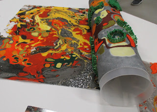
Her drawings have a paisley design essence, which are intricate and rich in colour. I am fond of the way she translated these drawings when dying her fabrics. Her use of marbling techniques have inspired me to experiment with a similar process of foiling, to create more interest on the surface of my weaves. The three-dimensional beadwork contrasts successfully against the fabric and helps achieve a high quality finish.
'Tactile Biology' - Alexandra Jordan
(Alexandra Jordan Design)
I think Alexandra’s context relates strongly to my interest in fashion and her work has helped inform my direction. I aim to produce wearable textiles within my specialism of weave, focusing on creating bespoke fashion accessories such as neckpieces and edges of garments. This would be achieved with a passementerie structure, consisting of a long, narrow width warp.